Tabletop
When Bad Art Breaks Great Games
Great mechanics can carry a mediocre board game, but when lazy art and poor graphic design get in the way of table fun, the gameplay suffers every single time.
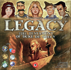
As someone who has enjoyed watching the likes of Downton Abbey and Bridgerton, I thought that I’d really love Obsession, a game about Victorian gentry trying to improve their estate by making the right connections and marrying family members to the right people to help elevate their status. My partner and I are already big fans of the table-hog of a game that is
Legacy: The Testament of Duke de Crecy, so this should have been an easy win, right?
When I finally got to try Obsession via Board Game Arena, I was rather disappointed by the text-heavy components of the game. The gameplay was okay, but I couldn’t get over how most of the game involved generic room tiles just with labels on them and little supporting art. I searched online to double-check if the actual game was like that and this wasn’t just limited to the BGA implementation, but the adaptation was accurate. The gameplay didn’t feel strong enough to justify owning a game like this, so we’ve limited ourselves to the occasional online game.
Board games are a very visual and tactile medium, and the quality of the components and the art does play a big role in the full game experience.
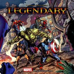
We had a similar experience with some of the Legendary deck-building games to different degrees. The Alien edition was the first Legendary game we had ever played, and this sort of defined the experience for us. So when we swung “back” and tried the Marvel base game, which was technically the first game in the franchise, we felt a little underwhelmed. Beyond the stark difference in how cards are played face down when they enter the “city” in Aliens but not so in Marvel, there was the question of the card art. It wasn’t bad art per se, but the base game heroes all had the exact same art for all 14 cards in each character-specific deck, something we didn’t see in the Alien game. In fact, all villain groups had more varied art than the heroes. At least the core ruleset remained solid, and all other expansions switched to unique art for each type of hero card in the character decks. And there were limited promos that provided alternate art for Black Widow, Deadpool, and the Hulk that I had to hunt down in the secondary market. It’s just as well that Legendary has a second edition coming out that addresses this old art concern.
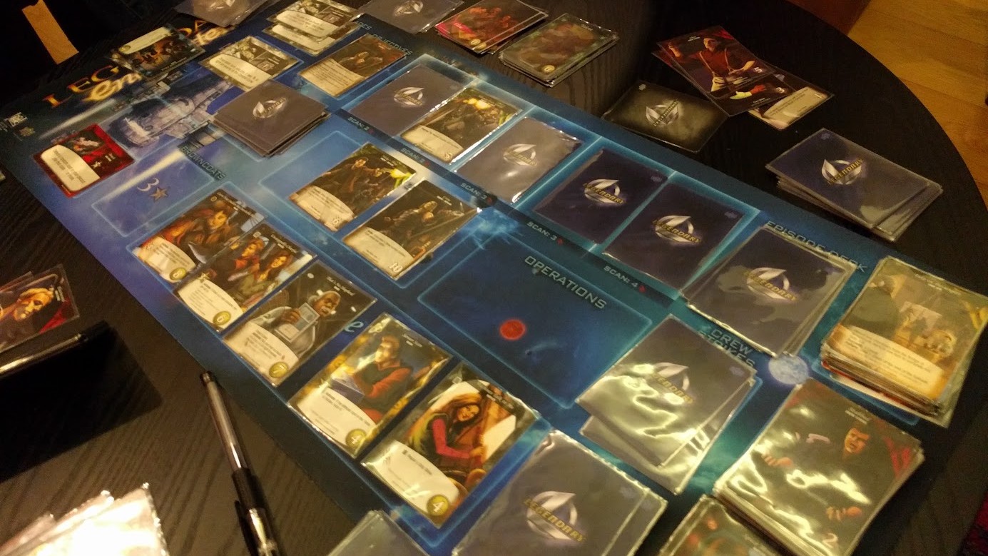
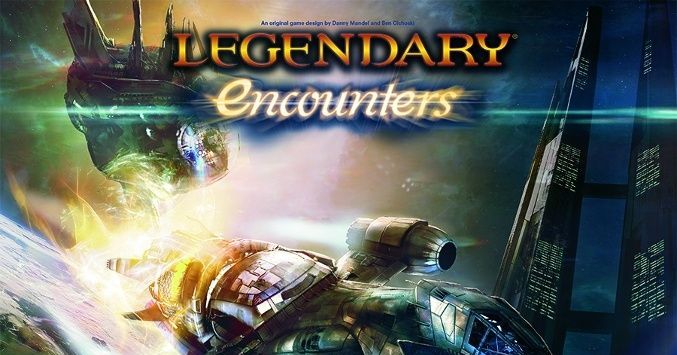
On the flip side, there’s the Firefly iteration of the game that features some really bad card art. Maybe this was subjective, or maybe our game group is rather fervent Firefly fans, but it was just super hard to accept the art style they chose for this game. Combine that with some very challenging missions, and this game ends up getting a lot less play than some other franchise adaptations. At least the James Bond, Buffy, and X-Files iterations used stills from the shows and relevant movies. Later adaptations like those for The Matrix and Game of Thrones went back to original illustrations, but very solid ones that serve the franchise fans well. At least the Legendary team has learned to make smarter art choices since then, and we haven’t had a game as visually jarring as Firefly since.
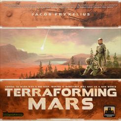
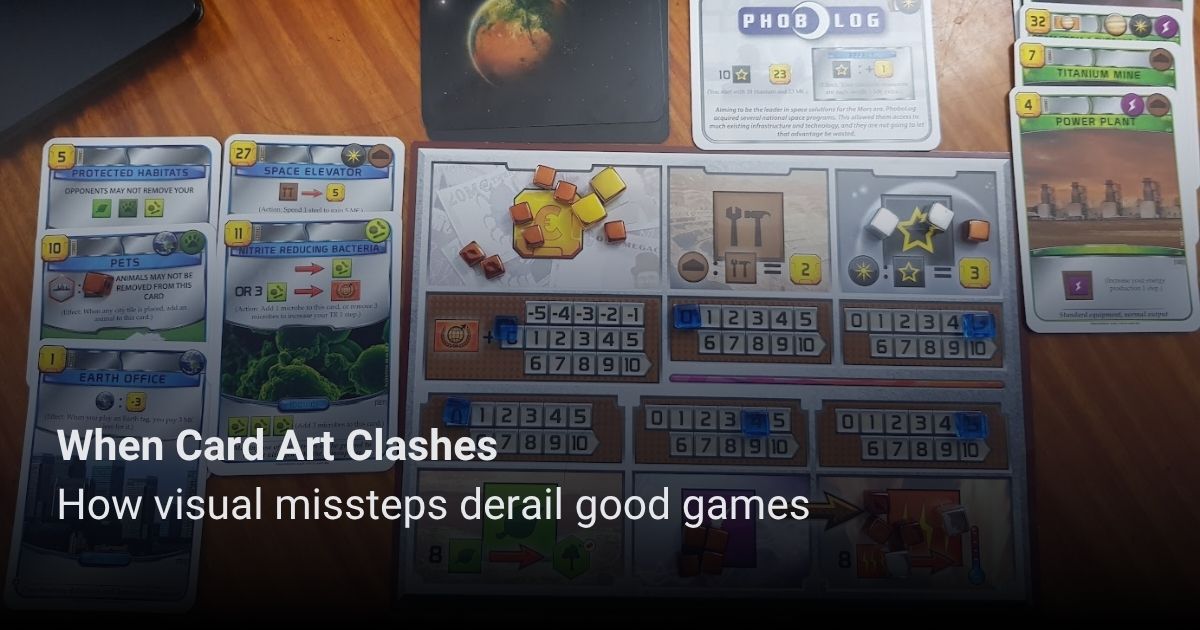
The biggest offender in this category has to be Terraforming Mars, which is a game whose gameplay and mechanics we really enjoy, but the art and initial board game components act as a major barrier to entry. Even during the hype years for the game, when it topped the BGG strategy game rankings and everyone was talking about it, we still had friends who had a hard time getting into the game because of its presentation. Things got a little better when they pushed for a big box on Kickstarter, together with upgraded components to replace the plain cardboard tiles that come with the base game, but that still didn’t address the weird stock photography they used for their art.
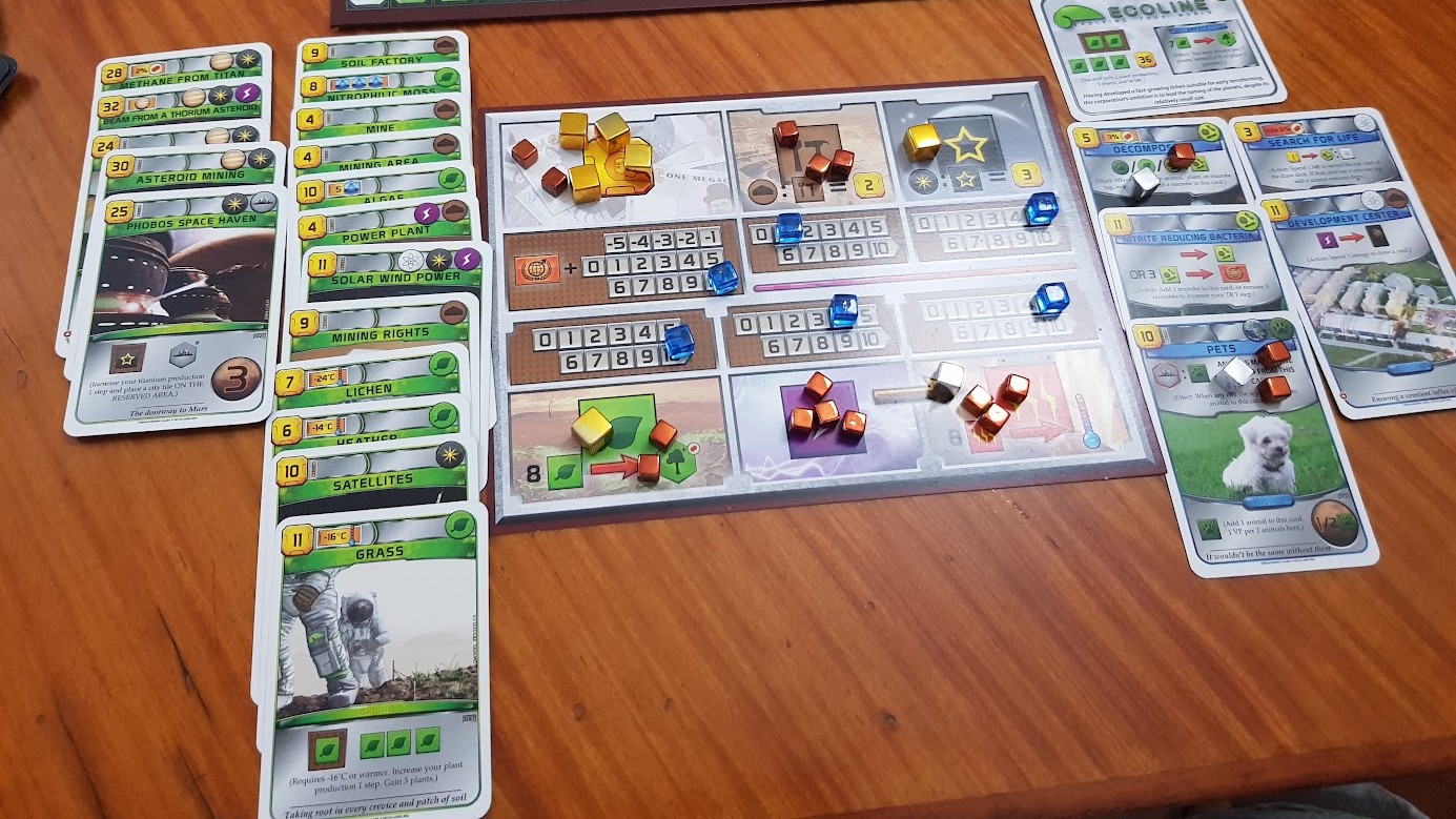
Things didn’t get any better with the More Terraforming Mars KS campaign that included a formal admission that AI tools were part of the work processes involved in the project. It wasn’t super specific about how much of the content would be AI-derived, but existing Terraforming Mars cards already looked pretty janky, so there was a lot of community backlash. At the same time, there are some really solid games in a similar category that look a lot better on the table even without special upgrades, including the likes of Ark Nova and Earth. It has become a lot harder to get this game to the table or justify investing in figure content given their controversial stance when it comes to AI.
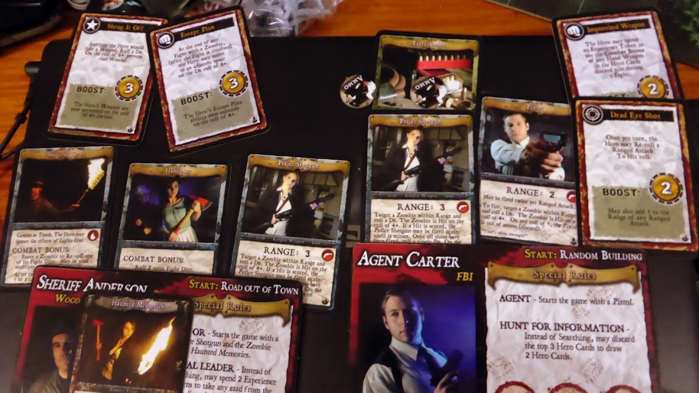
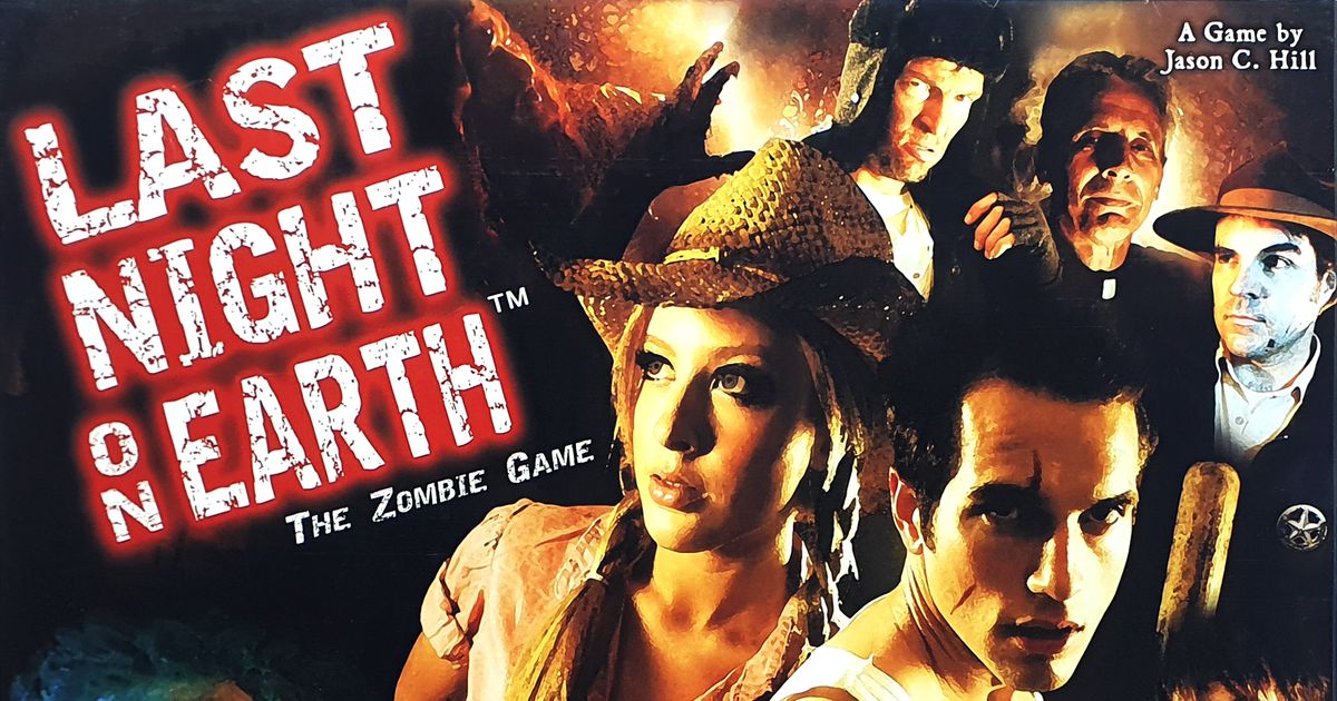
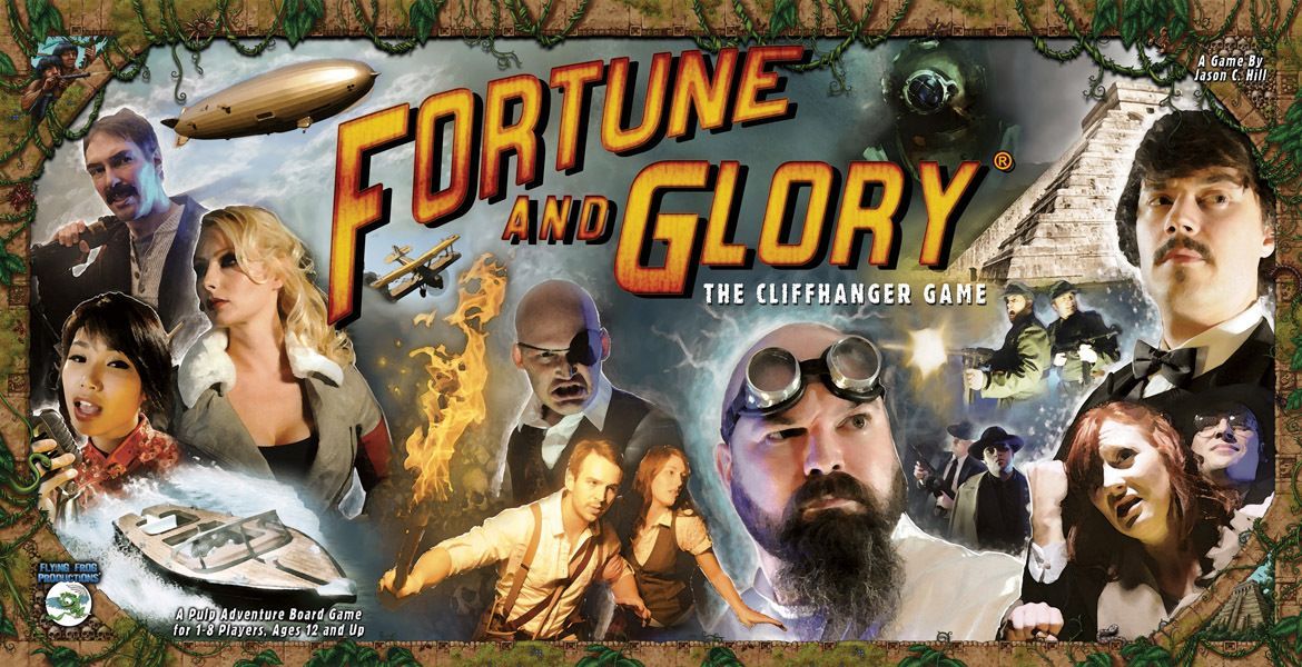
It’s not like every game needs to get the super deluxe treatment in terms of gorgeous art and upgraded components to make it feel special (unless you’re Eagle-Gryphon Games). But the visual presentation of the game still plays a big role in the gaming experience, and companies need to make smart investments in this area. I end up thinking of the early Flying Frog games Last Night on Earth and Fortune and Glory that used some really campy original photography to add some visual flair to their cards. There has to be a better way to balance the financial realities of board game production without resorting to really boring components or art with ethically questionable origins.